I mean how often does one get the opportunity in their career to design a gas station? Probably once. We looked at this as a branding exercise taking inspiration from the existing mark. We quickly gravitated towards some type of arrow gesture. We liked the idea of of an arrow as it suggests movement, but we didn’t think the current one felt all that modern. So we made our own creating the shape from the logo itself. We really thought the notion of a big ass yellow arrow could be really cool and ownable . The arrow found its way in several areas of the station: The canopy, POP signage, and as an architectural piece.


The previous rainbow warrior station image.

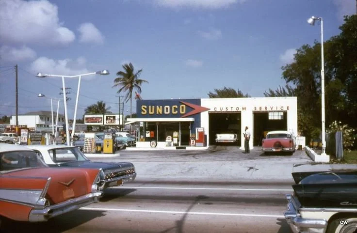
They knew what they were doing in the 50’s. We basically made this but modern.